In between scanning and coloring and cleaning the new RDCCDX episode, I've been working on a little bit of animation for Steve Borth. If you're a ska maniac like me, you'll know him from Link 80, RX Bandits and more recently Satori. He's got a new musical project, Recall Reality, and he asked me for a piece of animation to go along with some other visuals he's pulling together.
So this is a rough sample of the bit; Steve threading a reel to reel and pressing play. It's still missing two backgrounds, the tape the hands are pulling, color and love- but you get the drift.
Since threading a reel to reel is a lot of tiny hand movements, I tried to conserve drawings by doing a lot of movement in After Effects. It kind of gives it that computer-y Flash look, but it I think it works for what it is. The story of my life. It will look cooler once it's all colored and fancy.
Story Of My Life & Robot Rights
We're almost done scanning! The first episode of the new RDCCDX mini saga is on it's way.
It's funny, the actual animation of the episode only took a couple days of scanning, all of those head libraries were the real brunt of it. Those head libraries are supposed to be our short cuts of course, so that we wouldn't have redraw a head and set of mouths for each shot.
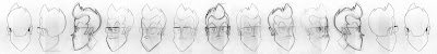 That's 11 heads, the profile head is just flipped. Each applicable head is paired with a set of 9 eyebrows and 8 eyes. Half of those are paired with 10 up-turned mouths, 8 down-turned mouths and 3 quiet mouths. I flip the mouth sets for the half of the heads facing the other way.
 I sort of explained before, but I thought I'd give it visuals. Here's a sneak peek at how some of the cleaned up drawings fit together in a rough After Effects project.
I probably could have saved myself time by reflecting/flipping/reversing the right set of heads into a left set of heads, but some characters aren't completely symmetrical- mostly in the hair department. Also, anytime I flip a drawing around it always looks slightly off. I must tend to lean my lines to one side or something.
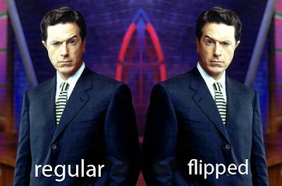
I don't know, some things just look different in a mirror reflection. Ever flip a picture of Stephen Colbert? Stupid question, everyone has. Doesn't Colbert look a lot different when his little ear is on the other side?
 We're through the looking glass here people.
You know, because it's a mirror reflection.
The Rand Corporation inconjunction with the Saucer People. . .Under the supervision of the Reverse Vampires & Robot Rights
I fixed up and inked up this possible t-shirt design I was working on. It's a ska t-shirt design. I want it to say "i still like ska" on it, because I feel like that's something people want other people to know- that they still like ska.
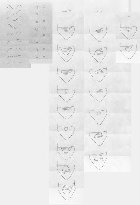
I tried to draw this semi-90's rude couple, but I can't decide which hair style to go with. In topical Olympic style, here are the three that would get some sort of medal.
1. long hair with head band:
 2. long bangs:
 3. short bangs:
 For some reason, most girls prefer the design with the short bangs. I can't decide yet so I might end up using multiple designs.
I tried out shading them with dots since I'd like to silk screen it myself and I can only do one color. It took me a while to figure out how to do this, but it's pretty simple:
Make a circle of color on a really small canvas and then go to Edit>Define Pattern. And you can make a pattern to use with the paint bucket tool. I would make little white circles over a black background, they weren't as harsh as black circles on white. Since I was working in 400 DPI, my dot canvas' were ranging from 11x11 pixels - 25x25 pixels- anything below 8 was looking like like gray.
Anyways, I'm worried all these details might be too small for my silk screening skills. I don't know. I might try to just do a print them on paper or something. Anyways, here are the other runner ups:
 Step right up folks-I got glasses or no glasses, long bangs with no little side thingies, I even have ones where the guy is in a hoodie with or without sunglasses.
 Man, all this gray is making me tired.
Shanghai(r) Knights & Robot Rights
I can't remember if it was Vectorman or X-Men 2: Clone Wars that I rented from Blockbuster on the day in 6th grade when I fell on my face, busted my upper lip area open and had to get stitches. It's actually a funny story which why I'm going to be talking about vectorizing bitmap images.
With two shots left for the new Ronin Dojo Community College DX episode- we're entering Scanning Week. It's kind of like Shark Week, but with twice as many dead Australians. In an effort to save myself some clean up time, I've been fooling around with vectorizing my images to make the clean up and coloring process easier.
Normally, I'd start with scanning a cleaned drawing into Photoshop :
 It always comes out gray and with strange colors and specks, so I have to de-saturate the drawing and tweak the levels of black and white (Image>Adjustments>Levels):
 I've created an action to do this all one fell swoop so it's really not a difficult process. But there's still problems, inevitable lines that didn't get connected and such.
 But since I don't have time to ink any of my drawings, there's always little white specks left in and around the pencil lines and black pencil smudges within the drawing.
 This image is better than most, but my cleaned drawings tend to have thick lines which contain even more miscellaneous white and gray pixels. Because of this, when I select and erase the area surrounding the character so that I can composite it against a background in After Effects, I get this ghosting effect. Even when the magic wand tolerance is set to 100. (For those unfamiliar with Photoshop, the magic wand is a valid tool not just me trying to make a nerd joke)
 If you click on this frame you'll see, close up, that there are white lines and specks around David. I used the Matte Choke tool in After Effects to contract the Alpha Channel so it bites into the line slightly- but it still had those gray and white pixels. Sure this doesn't look like a big deal, and it probably isn't even visible on YouTube, but all this extra clean up takes up a lot of time, especially if it's just going to look "ok" at full resolution.
So I thought I'd try out Toon Boom, which Jules suggested to me in the raging comments section of an earlier post. I don't know much about Toon Boom, but I do know that it can vectorize your drawings when you scan them or import them into the program. If you want to know about vector images scroll down to the bottom of this post- I'll explain it there. For everyone else- onto my date with the Toon Boom Studio Trial Version.
 I didn't really delve into the instructions, I skipped right to third base and tried to vectorize a drawing. It actually worked pretty well, and I didn't even have to clean anything. But the limited vector settings left my lines looking kinda wobbly.

 And I kind of missed my smooth round lines, even though they had pixel junk around it. If anyone is more familiar with Toon Boom, maybe they could give me some tips on working it. I know that Toon Boom Digital probably works way better, but I can't drop 3 g's on it.
Anyways, I remembered that Illustrator CS2 has that livetrace option that vectorizes images, so I tried that out. You can really tweak the settings so it actually turned out pretty good.
 Though close up there were still some funky artifacts from trying to vectorize the smaller details like the pupils. But it sure fixed up my white spots.
 I'm pretty sure that you can run a script in Illustrator to batch live trace a bunch of images at once, so I may try to do that. Not sure, but this line looks pretty clean, and decent enough for something I didn't draw in the computer. If anyone has any tips or thoughts on using Toon Boom or Illustrator for this, let me know. I'm gonna stop writing now. Here's a screen grab of my Livetrace settings in case anybody wants to know.
 Lite Brites & Robot Rights
Vector images- oy vey how am I going to put this-I guess you could think of them in terms of a Lite Brite.
You make an picture on a Lite Brite by putting a single green peg in one hole, and a single red peg in another hole and so forth. That's how a computer stores bitmap images- images like jpeg's or digital photos or what have you. It displays that awesome Jonas Brothers screen saver by making pixel 1 red and pixel 2 green and pixel 3 a dreamy dreamy blue- until you have the Jonas Brothers looking all deep and faux indie.
Now if you turned that screen saver into a vector image, it's like you said to the Lite Brite "Fuck all these pegs! I want everything from peg hole 2 to peg hole 58 to be red!" In a really rudimentary way- it's like instructions for the computer on how to make the image using coordinates rather than being a map of the image.
If you tried to scale up a bit map image real big, it would start getting all weird and pixelated and blurry because the computer doesn't know where to put the new "pegs". It's like "Damn it man, we had a system but now I got all these extra peg holes and I don't know what to put in them! Is this supposed to be a ballerina or Mickey Mouse!?" But with vector images- when everything is written in these instructions going from one peg to another, the computer can scale up the image as big as you want, because it just scales up the coordinates.
Of course the downside of this is that you're Jonas Brothers screen saver is going look like a still from A Scanner Darkly.
 The "coordinates" contain less information so the picture looks like everything is rounded off into patches of color and line.
That's why bitmaps are for photos and paintings and vector images are usually for logo artwork or advertising stuff you want to put on the side of a huge building. But if you use them right- they can work well for cartoons because the lines are so clean and easy to color. The trade off is that you'll have to either draw the pictures using a program like Illustrator or Flash, or you have to vectorize the a hand drawn image, which depending on the program and drawing, can produce odd results. If you go back and read the rest of the post you can see why.
PS- I don't know much about how computers actually work, so nobody cite this on wikipedia.

The Photoshop painting isn't my usual style but I think it looks ok. I made the original in 600 DPI in case I ever wanted to print a poster of it or something.
Also, here's a sketch of a ska t-shirt design I've been working on.
 I tried to make the girl's hair like Elyse Rogers' from the Dance Hall Crashers, but right now it looks too rmessy. I'm still searching for a hairdo a little shorter/tucked back and maybe more 90's-ish. If anyone has some sweet 90's ska pics link them my way.
Man, do you realize just how many Dance Hall Crashers videos there are? A lot. For a band that, as far as I can recall, on MTV much past maybe Skaturday, they sure pulled together some bank to make awesome super saturated 90's videos- and then this one. I guess it was because they were on MCA or something.
Point is, DHC are/is sweet, and I'm glad they have a bunch of videos. Oh and Adrian Tomine, one of my favorite comic book artists, did the cover for their live album:
 Definitely one of my favorites.
Cat Fight(s) & Robot Rights
There are only three shots left to animate for the new episode of Ronin Dojo Community College DX. If Matt and I can keep to this schedule, we should have it finished by September. In the meantime, check out this rough shot I finished yesterday. (You might have to hit play twice for it to work right)
It's not the best hit in the world, but it does show off some basic animation principles or techniques or whatever you want to call them. Let's take a closer look: The 2nd frame is a good example of things that look ridiculous in still frames but work in well in animation.
 First we've got Seth's head squashing together to really give some force to the hit. Squash is one half of the classic animation duo Stretch & Squash; the first thing you learn in animation classes in your rigorous hazing process of animating a bouncing ball while holding a cup of Dannon yogurt- with no hands.
There's also a smear frame in there as Mark whips away the video game case. Smears are awesome. They emulate the blurring that occurs in live action film and help move the eye along with action. If I had drawn Mark going from his position in frame 1 directly to his position in frame 3, it might have been a little jerky because it's such a big jump. Smearing his action, blending three in-between positions, helps make the jump seem more fluid, without adding more drawings.
Frames 3-5 have two instances of secondary motion going on.
 In frame 3, Mark's shirt sleeve and hair lag behind due to the quick movement. As Mark's body stops moving in frame 4, the sleeve and hair continue moving forward due to their detached momentum. By frame 5, the effects of gravity and Klautenberg's Second Law of Follicular Inertia bring the sleeves and hair respectively to their resting position. Marks arms also fall down a bit- settling into the squat.
I know I'm not an awesome animator, and have no qualifications to be talking like I'm Richard Williams or some shit, I just thought I'd entertain any onlookers who aren't familiar with the animation process. If you do want to learn more about this stuff from a pro- get Richard Williams book The Animator's Survival Kit. It's got pretty much everything you'd learn in animation classes.
Arabian Knights & Robot Rights
 That's 11 heads, the profile head is just flipped. Each applicable head is paired with a set of 9 eyebrows and 8 eyes. Half of those are paired with 10 up-turned mouths, 8 down-turned mouths and 3 quiet mouths. I flip the mouth sets for the half of the heads facing the other way.
 I sort of explained before, but I thought I'd give it visuals. Here's a sneak peek at how some of the cleaned up drawings fit together in a rough After Effects project.
 We're through the looking glass here people.
 2. long bangs:
 3. short bangs:
 For some reason, most girls prefer the design with the short bangs. I can't decide yet so I might end up using multiple designs.
 Step right up folks-I got glasses or no glasses, long bangs with no little side thingies, I even have ones where the guy is in a hoodie with or without sunglasses.
 Man, all this gray is making me tired.
 It always comes out gray and with strange colors and specks, so I have to de-saturate the drawing and tweak the levels of black and white (Image>Adjustments>Levels):
 I've created an action to do this all one fell swoop so it's really not a difficult process. But there's still problems, inevitable lines that didn't get connected and such.
 But since I don't have time to ink any of my drawings, there's always little white specks left in and around the pencil lines and black pencil smudges within the drawing.
 This image is better than most, but my cleaned drawings tend to have thick lines which contain even more miscellaneous white and gray pixels. Because of this, when I select and erase the area surrounding the character so that I can composite it against a background in After Effects, I get this ghosting effect. Even when the magic wand tolerance is set to 100. (For those unfamiliar with Photoshop, the magic wand is a valid tool not just me trying to make a nerd joke)
 If you click on this frame you'll see, close up, that there are white lines and specks around David. I used the Matte Choke tool in After Effects to contract the Alpha Channel so it bites into the line slightly- but it still had those gray and white pixels. Sure this doesn't look like a big deal, and it probably isn't even visible on YouTube, but all this extra clean up takes up a lot of time, especially if it's just going to look "ok" at full resolution.
 I didn't really delve into the instructions, I skipped right to third base and tried to vectorize a drawing. It actually worked pretty well, and I didn't even have to clean anything. But the limited vector settings left my lines looking kinda wobbly.
 And I kind of missed my smooth round lines, even though they had pixel junk around it. If anyone is more familiar with Toon Boom, maybe they could give me some tips on working it. I know that Toon Boom Digital probably works way better, but I can't drop 3 g's on it.
 Though close up there were still some funky artifacts from trying to vectorize the smaller details like the pupils. But it sure fixed up my white spots.
 I'm pretty sure that you can run a script in Illustrator to batch live trace a bunch of images at once, so I may try to do that. Not sure, but this line looks pretty clean, and decent enough for something I didn't draw in the computer. If anyone has any tips or thoughts on using Toon Boom or Illustrator for this, let me know. I'm gonna stop writing now. Here's a screen grab of my Livetrace settings in case anybody wants to know.
 I tried to make the girl's hair like Elyse Rogers' from the Dance Hall Crashers, but right now it looks too rmessy. I'm still searching for a hairdo a little shorter/tucked back and maybe more 90's-ish. If anyone has some sweet 90's ska pics link them my way.
 The 2nd frame is a good example of things that look ridiculous in still frames but work in well in animation.
 First we've got Seth's head squashing together to really give some force to the hit. Squash is one half of the classic animation duo Stretch & Squash; the first thing you learn in animation classes in your rigorous hazing process of animating a bouncing ball while holding a cup of Dannon yogurt- with no hands.
 In frame 3, Mark's shirt sleeve and hair lag behind due to the quick movement. As Mark's body stops moving in frame 4, the sleeve and hair continue moving forward due to their detached momentum. By frame 5, the effects of gravity and Klautenberg's Second Law of Follicular Inertia bring the sleeves and hair respectively to their resting position. Marks arms also fall down a bit- settling into the squat.