Wednesday, September 24, 2008

Learnding

Unfortunately, animation is a learning process. It's not like riding a roller coaster or eating a sandwich. But maybe it's kind of like eating a sandwich while riding a roller coaster. You always think you know how to do it, but some unseen problem comes up and the next thing you know your tomatoes are flying everywhere.

This time around, the bump that has sent my tomatoes flying is line thickness. If that's clear enough.

As I've mentioned before, Matt and I are using this system of head files, we create sets of heads for each character with movable and interchangeable mouths, eyes and eyebrows. It saves us the time of redrawing heads and mouths for each new shot, and for future shorts.

When we drew these heads, we drew them pretty big so that they could be used for close up shots and not look chunky. And for the close up's and medium shots, things have worked out pretty well.

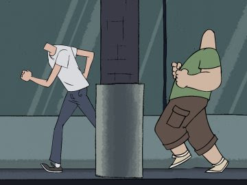
The problem is, when they're used for wide shots, the facial details look noticeably thinner than the rest of the shot, exaggerating the pasted on quality that we're trying to hide.

In addition to that, some of the bodies were drawn really small. So when put against each other, they look vastly different, and messy.

I've tried to close the line thickness gap by adding a 5-9 pixel stroke outline to the heads, but that doesn't always cut it . The sad truth is, even though the computer allows you to paste any separate drawn elements together, if they were drawn on vastly different scales it's going to show.

In the future, we have to make sure that we're drawing these bodies as big as possible so that the line quality and thickness matches with the size of the heads, and that we're cleaning up these drawings with a finer line. If doing that doesn't fix the problem, I might consider duplicating the head files and making one set specifically for medium/wide shots by putting a stroke on the facial details of each component.


For now though, I'm going back and re-cleaning several of the shots. It seems ridiculous this late in the game, being that we're one night of work away from being picture locked. But hey, you can't spell "animator" without "anal".

Sphincter Tight & Robot Rights

Friday, September 12, 2008

Do you smell what Barack is cooking?


Because seriously, is there anybody
else you'd really vote for? Assuming of course you're not writing in Chuck Yeager or any other famous test pilot. Boy, did I waste my vote with that in '04. More on the election stuff later though.

On another note- the new RDCCDX short is nearing nearerness to completion.

The major obstacles left- lip syncing to the dialogue track of Tim, Matt and myself cramming as many words as we could into 3 minutes, and then sound design. I might be jumping into Garageband to make a bit of music for this one like I did for the fight scene in IM IN UR MANGER. Not sure yet.

Check out Matt's blog to see a couple more stills of how it's looking.
In the meantime, I finished up the piece of animation for Steve Borth.


I know it's short, but it's got color, so that's gotta count for something.


Wednesday, September 10, 2008

For The Approval Of The Midnight Society

I present the Tale of More Headless Animation:

As you can see, I've been throwing in backgrounds and light effects and pulling this thing together. I figure by next week we should have the lip synced heads composited into all of the shots. Almost done.

A tip for anyone using After Effects to composite their animation- throwing a light or two in can give your shots that little extra something. For those not familiar with After Effects, it gives you the ability to put little spotlights into your compositions (shots). The "lights" are supposed to be used with 3-D environments, not the Pixar kind of expansive grassy field environments, but rather any composition that has elements utilizing Z space- the third dimension. Oooohweeoooh.

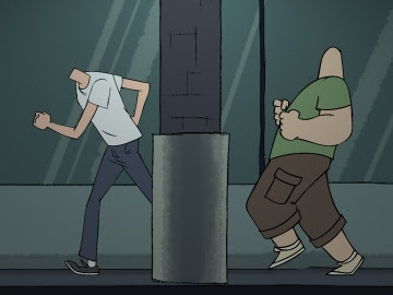
The way I use them is similar to angling a light onto a piece of paper. I'm just shooting light across 2-D planes to accentuate characters, simulate natural lighting, or just give the whole shot a slight gradient. Take the running shot for example.
The characters are supposed to be running around a strip mall at night. So I threw in a couple lights and angled one of them from above to make the scene being lit by the overhead shopping mall lights.
I gave them a slight green tint, to emulate fluorescence, and made sure to feather out the edges so that they weren't too noticeable. It adds a sense of depth somehow and looks ok, I don't know.

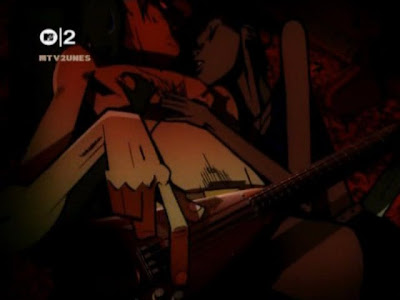
I remember really wanting to mess around more with lights after seeing a lot of Gorillaz videos, especially Feel Good Inc with all of it's dark red washes. I really wish I could animate that well or produce something that smoooooth.


For those just starting out in After Effects, try using both an Ambient light, to give yourself a base amount of light, with Spotlights to high light the characters or scene. You can mix the intensities of each depending on the look you're going for.


Sinful Lights & Robot Rights

Friday, September 5, 2008

For Batter Or For Worse -and- Backgrounds

The Cake Farmers of America commissioned me to draw this. I thought they were joking when they said they'd give me lots of dough to do it, but guess what showed up in the mail the other day? Yep, a can of frosting.

Anyways, here's some backgrounds for the upcoming Ronin Dojo Community College DX mini saga.


Backgrounds are real tough for me, I've never been good at building stuff and somehow that translates to drawing buildings. I don't know, but if you want to see a real master of design and layout and color- check out this blog entry on 101 Dalmations. This guy has a few interesting posts about the color and layout of the Disney/PETA classic, and man, it's the real deal stuff.


Cellulite & Robot Rights

Wednesday, September 3, 2008

I Have No Head! (tastes great!) I Have No Head! (less filling!)

This is my favorite part of the animation process. When I throw all the colored Photoshop files into an After Effects Comp at once, and it looks all crazy.
This is how the episode is looking right now. We've got all our shots laid out, but are still adjusting things and waiting to put in the backgrounds and lip synced heads. So until all of that is finished- it's just a bunch o' headless people standing around.
But this is what all of the tedious pre-production helped us accomplish. Now that we have head libraries for each character, animating and coloring the actual shots goes a lot smoother. Like with the shot above, all I had to draw was Mark's shoulders and neck. And for the running shot featured at the top of the post, I didn't have to redraw the head over and over, which helps a lot when you have to color little facial details.


If this shot were fully animated, I would have had to drawn each frame of the run with different mouth positions to match up with the sound track. But with this head system, I can just slug on a profile head from Mark's library, and turn off and on mouth layers in After Effects to make him talk. And if the timing or dialogue changes, I don't have to redo any drawings. Plus, I can now reuse the run cycle in another episode even though Mark might be saying something completely different.

This isn't a new idea, cartoons use short cuts like this all the time. If a character is standing and talking, they'll just draw the body and hold that frame while they animate the head or arms. Some TV shows which are animated within the United States use extensive character libraries in programs like Flash or After Effects to cut down on actual drawing time and save money. This can produce mixed results of course, but I think shows like South Park are a pretty good example of what can be done.

Anyways, I'm not saying animation should be made cheaper and quicker, but when you're just two dudes in Queens trying to animate a cartoon- you take short cuts. Sort of. How many months have we been working on this?


10 Yard Fight & Robot Rights